
Erebus - New Cover Art
Erebus has new cover art.
Erebus has new cover art! The novella is available as a 99 cent standalone or as part of the Haydens World: Volume 1 bundle.


Creating the Hayden's Bundle Cover
I give away a few of my secrets for creating retro book covers.
I create all of my own book cover art. Some books, like Titan's Shadow, use licensed Adobe stock photos overlaid with title text. Others, like Aero One, are completely digitally hand-drawn. A few use a mix of 3D modeling and hand-drawn art. Hayden's Bundle fits in that last category.
When I started my self-publishing journey I was at a bit of a loss for how to generate a decent cover, so I thought I'd share some of my tricks.
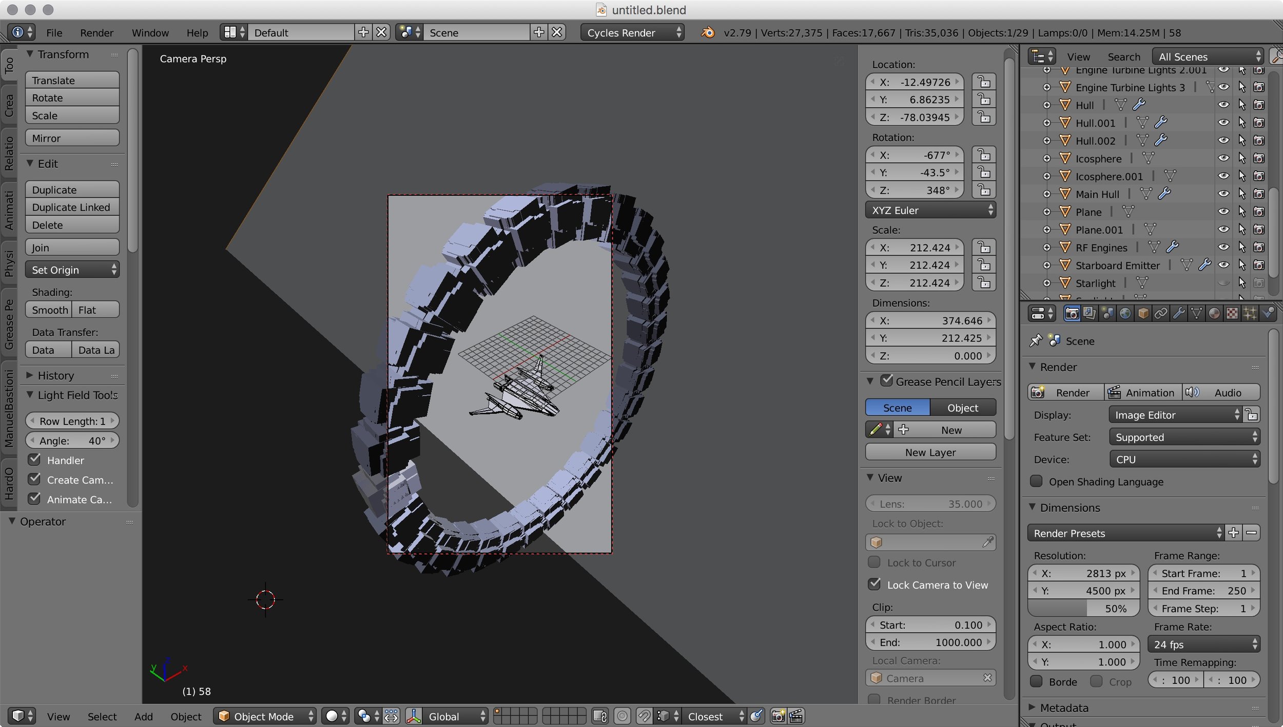
I already had a 3D model of Bernard's Beauty from the 43 Seconds cover, so I reused it. The ring (which is Cassini One in Erebus) was quickly created in Blender just by discombobulating a cube and radially spinning it. I didn't put much effort into materials, textures, or photorealism. The whole intent of the 3D model was to be the pose for the hand-drawn picture. Here it is modeled:
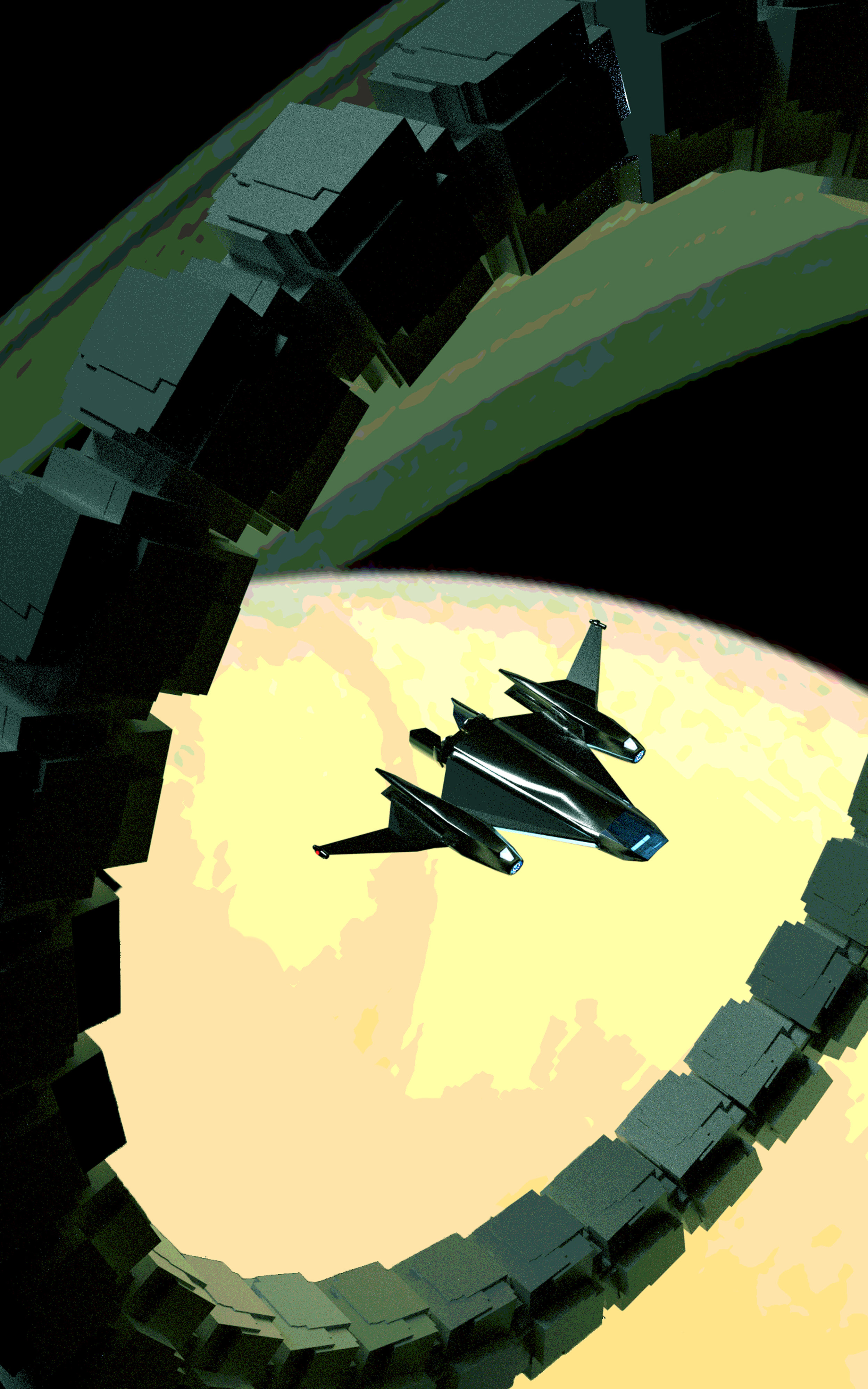
The goal was for the final art to have a retro, stylized look. Because of this, I wanted to have a limited color palette. The next step was to import the render into Photoshop and run it through a posterization filter, reducing the color levels. I tinkered with the color balance at this point, shifting it green:
Now comes the hard part. I masked every detail of the plate and repainted it by hand. Before I started, I worked out the color palette, choosing seven main colors for the picture. I constrained myself to only create new colors by mixing the main colors. This helped give the picture color harmony:

Main colors at top. I started mixing intermediates beneath them.

Masking the plate and hand-painting over it. Aside from assigning new colors, this let me simplify many of the complex shapes and gradients.
This was very labor-intensive. Some details, such as the starry background, needed to be created from scratch using Photoshop brushes. Once it was finished, I used Photoshop's color balance feature to adjust the overall color-scheme, then I moved on to the text. I have some standard fonts and effects I use in the Hayden's World series, so most of the text settings are reapplications from previous covers. The real trick here is working the layout so the text works with the art:
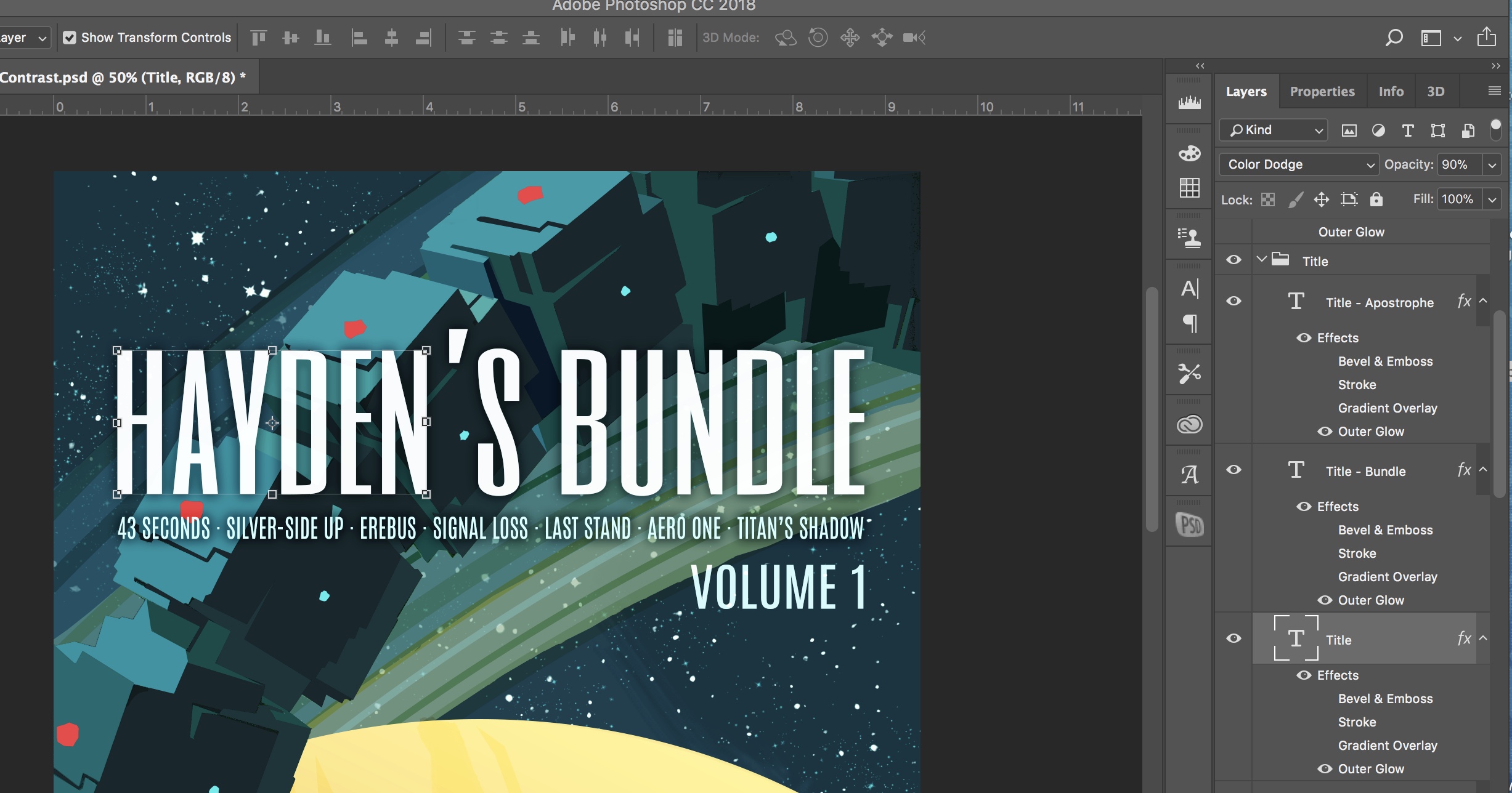
Text layers at right. Outer glow is enabled for the letters, but is set to a dark color, creating a shadow to enhance legibility.
That's it! I save the image in the correct dimensions for Kindle, and I'm good to go.

The last thing I do is make some quick social medial blocks, just by cropping. Here's the title block I use from Twitter promos:

Hope this was helpful. Enjoy!

Hayden's World Shorts - Paperback Artwork
The paperback edition of Hayden's World Shorts is now available. I created new full-cover artwork for it.
One of the bits of trivia about me is that I majored in mechanical engineering but minored in graphic design. As I began self-publishing, it's been fun to dust off the graphic design skills and create my own book covers.
After a few requests for a print edition of Hayden's World Shorts, I decided to release the paperback. This required designing wrap-around artwork for the front and back covers.
Here's the final art. You can get the print edition here.


The Golden Age
If you've seen the movie Gentleman Broncos, the opening credits feature a montage of pulp sci-fi covers. You know the type - alien tentacles wrapping around an alarmed female astronaut while a crewman pulls out a blaster. You can actually see the brush strokes in the paint.
If you've seen the movie Gentleman Broncos, the opening credits feature a montage of pulp sci-fi covers. You know the type - alien tentacles wrapping around an alarmed female astronaut while a crewman pulls out a blaster. You can actually see the brush strokes in the paint. I love it!
I started a Pinterest board collecting vintage sci-fi book covers. Although my intent was to find crazy 50s - 80s illustrations, I couldn't help but gravitating to all of the classic books that I loved. Clarke, Asimov, Pournelle, Niven, Pohl, Bester. So, at least the first round of pics are more nostalgia based than art, but I'll keep growing the list.
You can check it out on Pinterest, and follow me for updates.

Tales of a Rookie - Part 1
When I first started writing stories, there were three choices for getting words on paper: pen and paper, typewriter, word processor. Things have evolved since then, and now there's dedicated writing software.
When I first started writing stories, there were three choices for getting words on paper: pen and paper, typewriter, word processor. Things have evolved since then, and now there's dedicated writing software. I've tried both Ulysses and Scrivener. I can say it's practically impossible to read a modern writing book without tripping over Scrivener raves. It's what I ended up picking.
Here's my impressions:
Ulysses
- Beautiful, clean interface. Really a joy to type in Ulysses. It actually seems designed to encourage you to write.
- Uses Markdown for formatting. Takes a little getting used to if you don't write in Markdown.
- Projects sync easily with the cloud.
- There is an iPad app so you can access your writing on the go.
- Although there's no reason you couldn't write a novel in Ulysses, it seems best suited for writing smaller works. It seems like it'd be awesome for writing articles.
Scrivener
- Scrivener is all about organization. It's project management software for writers. If you want a place to keep all of your notes, research, character/locations details, and book reviews, plus organize all of the chapters and text of your novel, Scrivener is for you.
- Similar to Ulysses, you chose the format of the project when you export it. You can write the entire draft in single-space Times New Roman if you want, then chose an export preset to put it all in standard manuscript submission format.
- The interface is not very intuitive. It's like trying to guess your way through Photoshop.
- It does have distraction-free writing modes, but Ulysses is much nicer for distraction-free writing
- In a way, it's the opposite of Ulysses. It really shines when you're working on a big, complex project.
Scrivener comes with a few templates, but you'll end up configuring it the way you like. Here's the set up for 43 Seconds:

I started with the default Short Story template and added a few folders:
- First Page Header: lists my name, address, phone and story word count in standard submission format. Only included when submitting to magazines. My preset for Kindle excludes this during compile.
- Back Matter: I purposely moved everything to the end of my book to ensure the free Amazon samples include the first few pages of the story. I didn't want those pages to be all copyright notices and table of contents. My back matter section includes the title page with copyright, table of contents, author's message with hyperlinks to my website, about the the author, and dedication. The table of contents was manually created. If I'd used Scrivener's auto-create TOC function, it would end up at the beginning.
- Blurb: The short pitch for the story that appears on Amazon. I just copy/paste from this when uploading my story to Kindle Direct Publishing. I have some brainstormed variants stored here.
- Reviews: Notes from reviews, as well as review text which may be pasted in the Amazon Review section.
- To Do: Things to fix in the next version.
- Front Matter: I've added the image for my cover, and an "Also By" page. Note when you upload the file to Kindle Direct Publishing, Amazon ignores the cover art in the .mobi file. You need to upload it separately in the KDP screen.
I like to write in Georgia twelve-point font, double-spaced. You can set it up however you like, because you'll configure the output font and spacing in the compile screen. I've installed Kindlegen (available free from Amazon) and created a Kindle format preset, so my output is in Kindle's standard .mobi format.
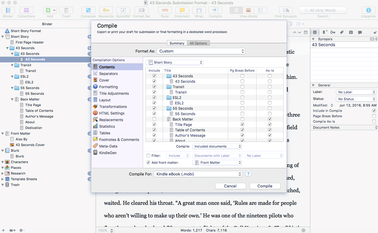
Compiling (Scrivener's lingo for exporting) my story in Kindle .mobi format.
If you own a Kindle, you probably know that you can email documents to your Kindle's email address, and read them on your Kindle. This was great for proofing the .mobi file.
My first readers received pdf versions of the story, and it was simple just to change the compile preset from .mobi to pdf.
That's it! Scrivener is great for organizing your writing. If only they'd finally get around to writing an iPad app for it.
In my next few posts, I'll talk about my experience submitting to Kindle Direct Publishing, enrolling in Kindle Select, and hosting a free promotion.

43 Seconds - Cover Design
As I set about self-publishing my short story, I decided I wanted to do everything myself. This included the cover design. I admit I have a certain fondness for classic 50s, 60s, and 70s paperback science fiction covers, and I thought it would be fun to have a slightly retro, stylized look to the cover.

As I set about self-publishing my short story, I decided I wanted to do everything myself. This included the cover design. I started with stock photos of the Milky Way for the backdrop, but this looked like every other sci-fi book cover on Amazon. I admit I have a certain fondness for classic 50s, 60s, and 70s paperback science fiction covers, and I thought it would be fun to have a slightly retro, stylized look to the cover.
I chose Adobe Illustrator because vector art lined up best with this concept. I wanted to keep the colors and lines clean and simple.

The finished cover design in Illustrator
I've used both Illustrator and Photoshop, and I find Illustrator more intuitive. Maybe it's because, in a world of Microsoft Office and Powerpoint, we're just used to moving around vector graphics. Each element is independent and can have its own set of unique adjustments and effects. For example, the blue lights on the ship have and outer glow effect applied.

Mmmm, glowy.
Text is very easy to lay out. I thought the original design looked fine, until I scaled it to Amazon thumbnail size. The text was illegible. Enlarging all of the text afterwards was easy, and made for a more readable design. As an aside, designing for something which must have a thumbnail view significantly changes some of your classic ideas about proportions in design.
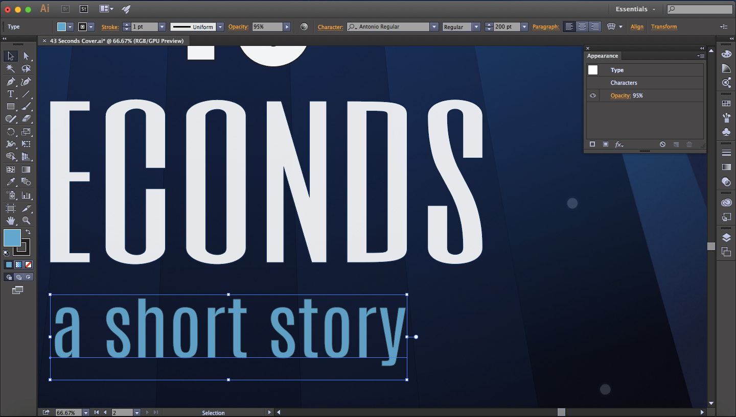
I pushed the opacity down slightly on many of the foreground elements, such as the subtitle, to blend in some of the background color and create better color harmony
Another great feature of Illustrator is artboards. You can create multiple layouts and pin them to different places in your workspace. This was perfect for trying out different versions of the artwork. Here's an example of artboards used for my site's logo design, with different sizes for Facebook banners, avatars, and website headers.

If you save design elements, such as the rocket ship logo, to your library, edits will update each place they appear in an artboard.
The best part about doing the cover design myself: no licensing! I can share the images as much as a want, in any format. Plus, it's just fun to do it yourself.