Creating the Hayden's Bundle Cover
I create all of my own book cover art. Some books, like Titan's Shadow, use licensed Adobe stock photos overlaid with title text. Others, like Aero One, are completely digitally hand-drawn. A few use a mix of 3D modeling and hand-drawn art. Hayden's Bundle fits in that last category.
When I started my self-publishing journey I was at a bit of a loss for how to generate a decent cover, so I thought I'd share some of my tricks.
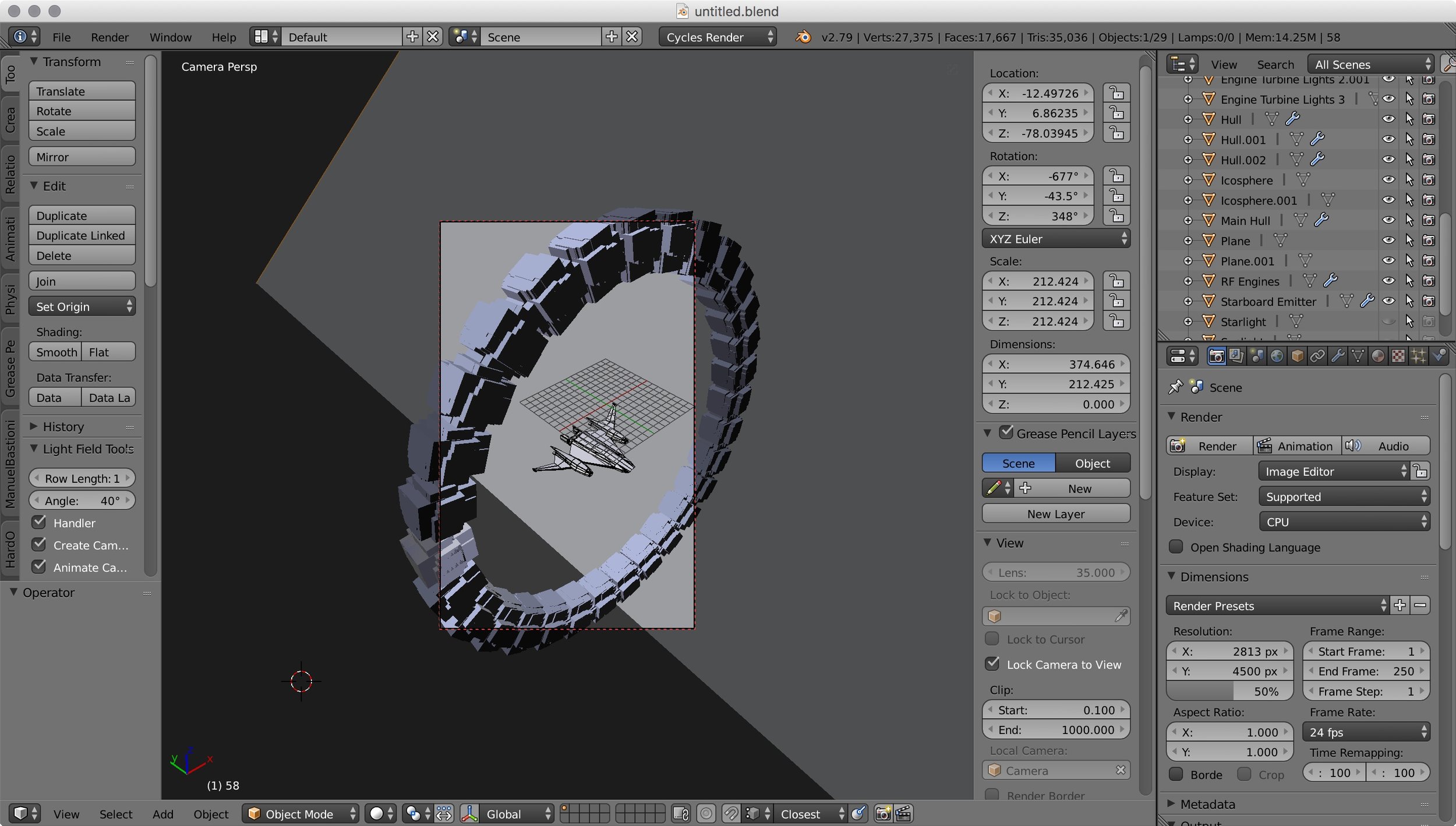
I already had a 3D model of Bernard's Beauty from the 43 Seconds cover, so I reused it. The ring (which is Cassini One in Erebus) was quickly created in Blender just by discombobulating a cube and radially spinning it. I didn't put much effort into materials, textures, or photorealism. The whole intent of the 3D model was to be the pose for the hand-drawn picture. Here it is modeled:
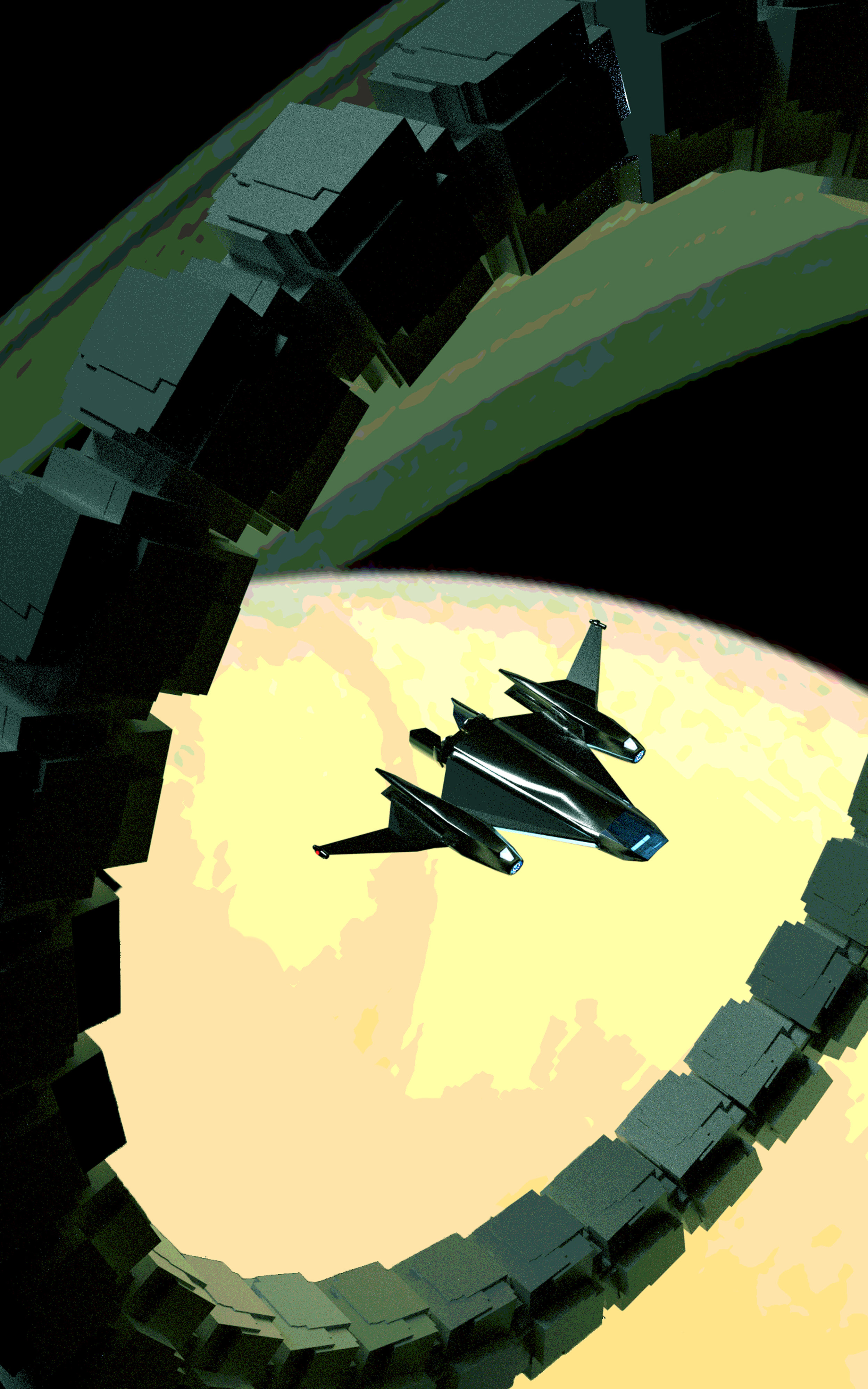
The goal was for the final art to have a retro, stylized look. Because of this, I wanted to have a limited color palette. The next step was to import the render into Photoshop and run it through a posterization filter, reducing the color levels. I tinkered with the color balance at this point, shifting it green:
Now comes the hard part. I masked every detail of the plate and repainted it by hand. Before I started, I worked out the color palette, choosing seven main colors for the picture. I constrained myself to only create new colors by mixing the main colors. This helped give the picture color harmony:

Main colors at top. I started mixing intermediates beneath them.

Masking the plate and hand-painting over it. Aside from assigning new colors, this let me simplify many of the complex shapes and gradients.
This was very labor-intensive. Some details, such as the starry background, needed to be created from scratch using Photoshop brushes. Once it was finished, I used Photoshop's color balance feature to adjust the overall color-scheme, then I moved on to the text. I have some standard fonts and effects I use in the Hayden's World series, so most of the text settings are reapplications from previous covers. The real trick here is working the layout so the text works with the art:
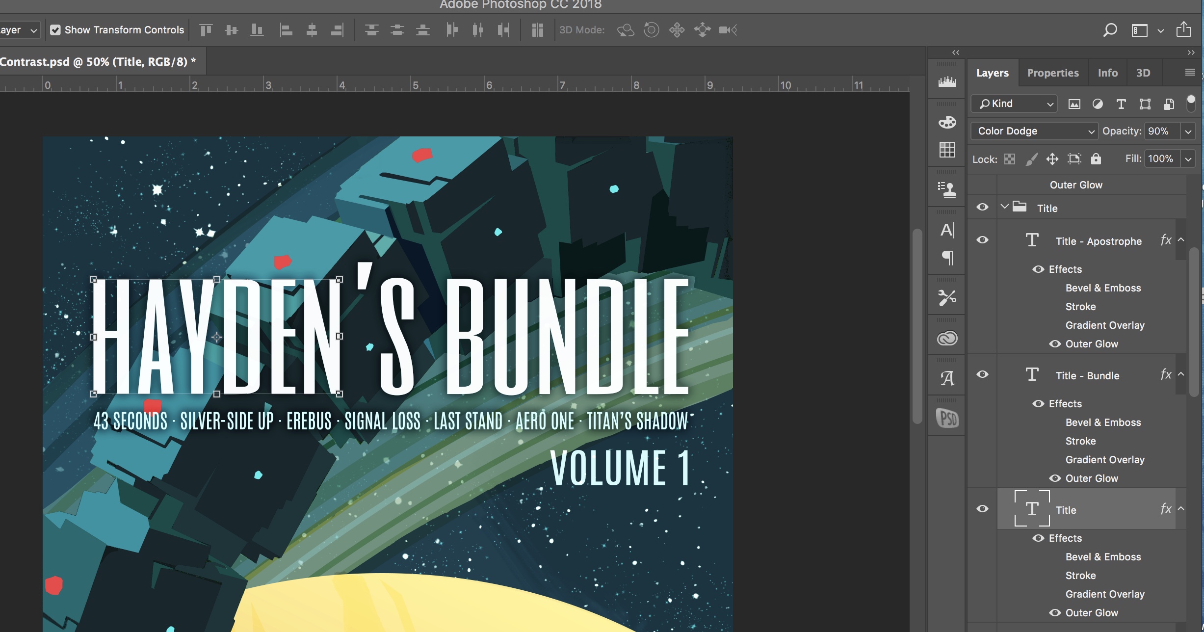
Text layers at right. Outer glow is enabled for the letters, but is set to a dark color, creating a shadow to enhance legibility.
That's it! I save the image in the correct dimensions for Kindle, and I'm good to go.

The last thing I do is make some quick social medial blocks, just by cropping. Here's the title block I use from Twitter promos:

Hope this was helpful. Enjoy!