
As the blinking cursor awaited my instruction, I typed the final sentence of my short story and leaned back to admire it. “Keep dreaming big, James. We have three hundred billion stars waiting for us.” It was a good line, and a fitting kickoff both for the Hayden’s World series and my indie writing career. Career is a bit of an overstatement, perhaps…but it was indeed a launch. After formatting my story and readying to submit it to Kindle Direct Publishing, I realized the next hurdle had materialized: the book cover. How on earth do you make a book cover?
Through a little Googling, I found Canva. My first attempt was a stock image starfield with the words 43 Seconds overlaying it. I scratched my chin. I can do better.
If you’re an indie author like me, you’ve probably endured for-an-indie-author-itis. It goes something like this: This story is well written, for an indie author. That’s a nice cover, for an indie author. I think that sometimes people forget that everyone has his own unique background and one of the appeals of being an indie author is being able to play many parts in the self-publishing process. In my case, I majored in mechanical engineering, which has directly helped with the hard science content in my writing, but I minored in graphic design. After graduating, I spent my days working as a mechanical engineer but my nights and weekends were spent creating artwork. Over the next fifteen years I built my artwork resume with group, juried, and solo shows, and my artwork appeared in magazines such as The Artist’s Magazine and Drawing Magazine and books such as Strokes of Genius: The Best of Drawing. I chose my author name, S.D.Falchetti, with just my abbreviated initials because my full name and website were already in use for my art career (shawnfalchetti.com).

So, back to me staring at my generic starfield cover. Here’s where I hit a slight snafu. I had almost no digital art training. Everything I’d done up to this point had been traditional artwork. Even my graphic design courses used hand-drawn layouts on drafting tables. So, I taught myself Adobe Illustrator and Adobe Photoshop. My first three book covers were made in Adobe Illustrator and I was shooting for a very stylized, minimalistic look:
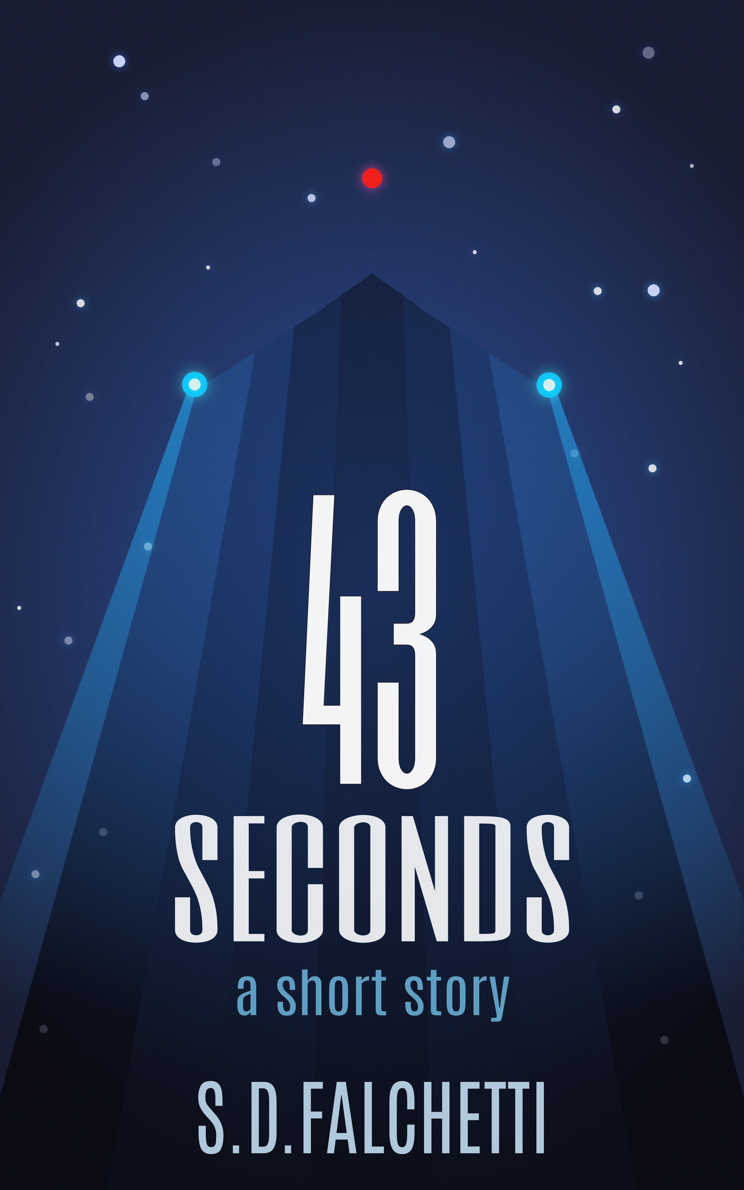

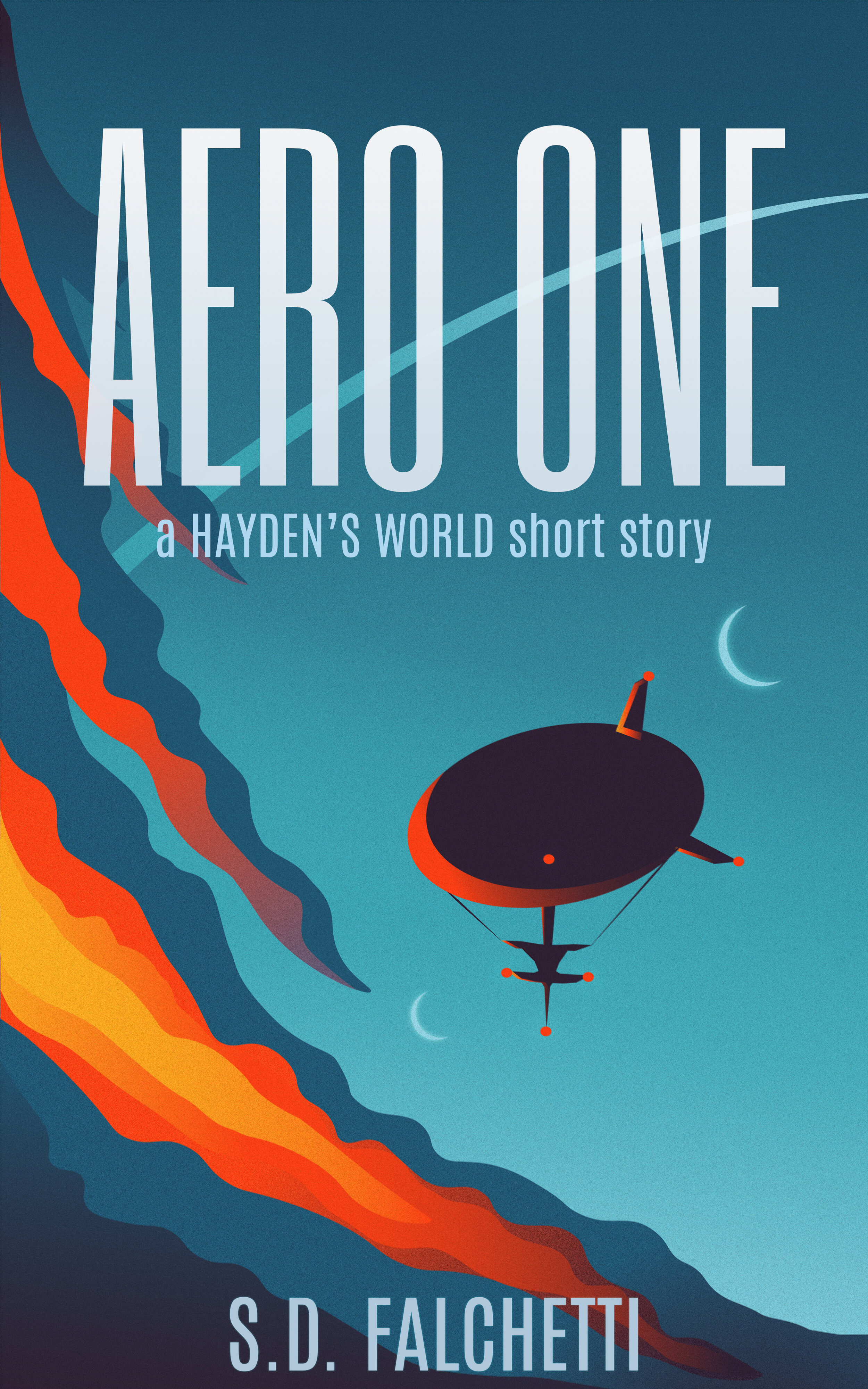
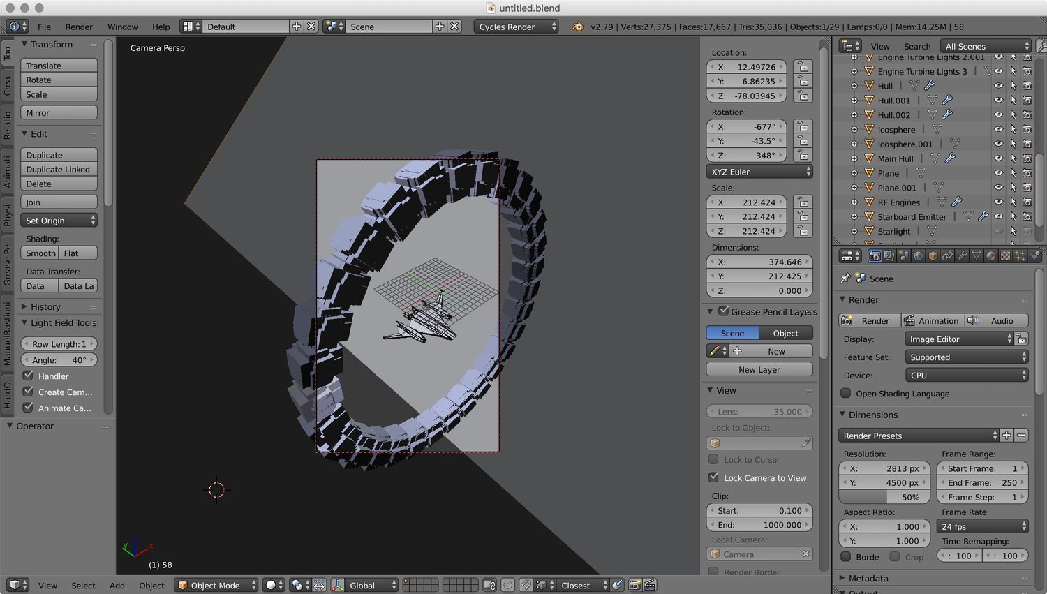
Out of that bunch, Aero One was the standout, and I kept it. For 43 Seconds and Signal Loss, however, I decided I wanted to go a different route. Science fiction book covers should clearly announce they are science fiction through their imagery, and most covers in the genre have a photorealistic look. So…how to create photorealism? Well, as an engineer I spent many hours learning how to three-dimensionally model things in AutoCad, so the leap to 3D modeling software was more of a short hop. I taught myself Blender. One of my first Blender objects was a space module I pieced together as an experiment. When I hit the render button, I’d realized I found a winner.

In no time, I was creating my own space ships and scenes. I felt like I’d discovered a digital version of George Lucas’s model shop. Here’s the rough model of Bernard’s Beauty, before texturing:

Here’s the Aristarchus and Resolve, which would later grace the new cover of Signal Loss:


Test rendering for Signal Loss ship plate
Of course these are just the models. They need to be assembled into a composite plate with a background and the overlaying cover text. For this, I used Photoshop:

Plenty of color correction and additional art effects added in Photoshop to the ship plate, with overlaid text layers
Over time, I learned how to make configurable Blender models for common background objects like planets. Now by tweaking a few parameters and textures, I could have ringed worlds, icy worlds, moons, or rocky planets with oceans.

The planet Astris, above, appears on the cover of Bernard’s Promise, below:


Erebus composite of starfield background, planet, and ship plates.
I also discovered that I could fuse the 3D modeling techniques used for my photorealistic covers with the stylized minimalism of my earlier Illustrator covers. By merging the 3D models of Bernard’s Beauty and the Cassini One Ring with hand-drawn artwork, I created the cover of Hayden’s World: Volume 1. It has a nice, retro, pulpy-art feel to it:
Cassini One and Bernard’s Beauty Blender model

Digitally hand painting using a limited color palette

Composite final plate
When it was time to create the hardcover version of my books, complete with a folding dust jacket, I had all of the art assets because I had created them myself, and it was easy to expand the layout to include the spine, back cover, and sleeve layouts. Now, when I say easy, it wasn’t really easy. Graphic design is actually pretty hard, especially for a multipage layout like a dust jacket. But, I loved doing it. I could make covers all day long. The resulting covers have a common design language and clearly are part of the same series:


So, that’s it - my book cover journey, and a few secrets of how I do things. I hope you enjoy both the stories and artwork. Thanks for following along.